"Much has been written about the effects of colour on people as philosopher and Freemason, Johann Wolfgang von Goethe discussed optics and the physiological effects of colours in 1810. A recent study illustrates gender sensitivities to colour as females seem more ‘colour conscious’ and there colour tastes more “flexible and diverse.”ii When a person is exposed to the colour red dramatic physiologic effect’s may be observed including the release of adrenalin, elevated heart rate, and an increase in gastric activity- hence the practical use of red or red-checked table clothes in restaurants. The application of orange and reds (warm colours) to interior’s or the use of interior accents, such as candles, with low-level light output, serve to enhance an intimate psychological effect when applied to dining. Electroencephalogram and pulse rates of people recorded accelerated heart rates when in a grey room than in a colourful room (Kuller 1976)."
Source: A Report on Psychology & Architecture By W. Bro. Victor G. Popow, Dec 2000. V1
Imagine how much more effective the design process would be if you knew what your clients were really thinking.
What colors inspire them? How do they interact with their physical environments? How does sunlight make them feel?
"Research shows that only 5% of what the average person thinks can be expressed verbally," says Del Sole. The other 95% is hidden deep within the subconscious.
Solution is there:
Del Sole's Pittsburgh-based consulting firm,fathom, applies a staid research technique to probe the conscious and subconscious thoughts of user groups and then translates these thoughts into design approaches. Think of it as a shrink session for building occupants. Developed by Harvard Business School professor Gerald Zaltman, the technique has been used for years by Coca-Cola, DuPont, and other Fortune 500 companies as a market research tool for product and brand development. Now, fathom is bringing it to the architectural community to help designers create better environments.
How?
1. Ask questions a typical designer would not ask, and in ways that uncover the deepest thoughts. 2. Key to the process is the use of art therapy during initial one-on-one interviews with end users. They ask them to bring six to eight images that explain their thoughts and feelings about their most recent experience at the facility >>> Gives a snapshot of what's going on inside their head and gives some objectives like transformation," "energy," "control" among the group of users.
3. These objectives are then matched with the client's programmatic needs to come up with a prioritized design guide.
Example:
Children's Hospital of Pittsburgh, currently under construction. One-on-one interviews with 29 patients, nurses, and doctors resulted in metaphors like "control," "energy," and "connection."
They found that: 1- The children wanted the new hospital to feel home-like and comfortable, but not too much like home because they felt that they wanted to be able to leave it. 2-The kids were very intimated by the height of the beds.
As a result: 1- Architects reworked the design scheme, introducing bright, vibrant colors, softer materials, and patient-friendly features: a healing garden, private rooms, and individual temperature controls for patient rooms. 2- They are working with a manufacturer to design a bed that is much lower to the ground, but can be raised when nurses and doctors come in. For more: www.gofathom.com ~Research Method~
Human psychology is directly related with architecture. Appropriate use of various architectural components has the capacity of enlightening the atmosphere whereas inappropriate use does the opposite. The building forms, the functions incorporated in it, colors, negative and positive spaces in and around it may be the few points but architecture is directly attached with human psychology from conscious to subconscious level.
Some of the components of architecture which affects human psychology are:
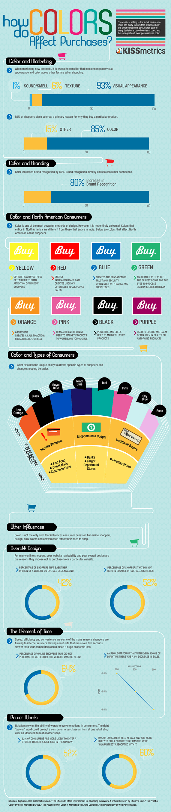
For retailers, shopping is the art of persuasion. Though there are many factors that influence how and what consumers buy. However, a great deal is decided by visual cues, the strongest and most persuasive being color. When marketing new products it is crucial to consider that consumers place visual appearance and color above other factors such as sound, smell and texture. To learn more about color psychology and how it influences purchases, see our latest infographic.
Great infographic design can really get you noticed. It's a powerful tool for communicating complex ideas efficiently. Follow these simple steps for success...
Infographic design starts with 'why?'
The key to a memorable infographic is to understand its purpose. What are you trying to achieve?
Make the complicated, uncomplicated...
There's an old clich that proclaims that "a picture is worth a thousand words." The best examples encapsulate or explain an idea in a simple, visual way.
Map it out first
Don't make it up as you go along. Sit down with a pencil and paper and map out the flow of your infographic before you do any serious illustrative work. Consider using sidebars to break things up and make the design more digestible.
Don't try to include everything
Some infographics are huge and require some serious screen-scrolling before you reach the end. These might be taking the format too far. So, strip away redundant data and concentrate on the key message. The Psychology of Colour, created for PaintersofLouisville.com by nowsourcing.com. Click to see the full infographic design.
Offer a fresh perspective
Don't just take data and visualise it with pie charts and bar graphs.
Illustrate data sets and highlight patterns within them, make sure you give your data a twist and come at the presentation from a fresh perspective. See The Psychology of Colour infographic above and take a look at 10 great infographics (to inspire you to create your own).
Do your research3
It doesn't matter how pretty your infographic design looks if you've got your numbers wrong. Research. Then research some more.
Make your artwork stand out
Don't just ape another infographic's visuals. Bring your own style into play and create something that truly stands out.
Choose a delivery system
The basic infographic type is the 'explainer' - a clever, visual representation of basic data.
Consider infographic design that compares and contrasts data (like 'Geek vs Nerd' below; tells a story through a timeline/flow chart; or annotates something, like a product. Lists can also be visualised, as can 'how to'/tutorial content. Geek vs Nerds, created by mastersinit.org. Click to see the full infographic design.
Minimise the words
Communicate ideas with shapes, graphs, diagrams and pictures. If you have to explain your infographic then it isn't doing its job.
Make it sharable
Include social media buttons on your blog or website. Like any blog post, your infographic design should be topped with a great headline to help it get noticed on less visual channels like Twitter, Reddit and RSS feed readers.


![The Psychology of Color [Infographic]](http://nowsourcing.com/blog/wp-content/uploads/2012/01/psychology-of-color.png)

